Michael Irvin is The Fourth Worst Dressed Athlete
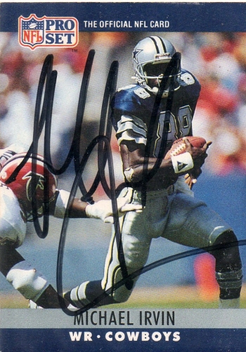
Michael Irvin is a Hall of Fame Football player who had a penchant for garish and outlandish fashion components. There is nothing understated or subtle about Irvin who nicknamed himself “The Playmaker.” He was a phenomenal athlete who celebrated his fame with fortune often accessorizing with loudly patterned shirts and accessories that were oversized and overblinged. Irvin’s loud plays on the field made him one of the best football players of all time while his loud fashion proclivities off the field have made him one of the worst dressed athletes of all time. We’ve outlined some of Irvin’s “loudest” fashion mishaps below in hopes of creating a world of better dressed athletes and a world of less bling.
Shirts Featuring Loud Prints
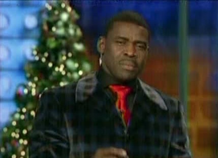
If there’s a single word that describes Michael Irvin’s approach to style and fashion, it’s assuredly “loud.” The prints that Irvin tends to embrace in his shirts are all over the place; exceptionally outlandish and full of bright, bold and brazen colors. Many of the motifs can even be considered “cartoonish,” as some feature fictional characters and scenes that look as if they’re right out of a Disney movie. While it’s clear that he’s going for something unique and authentically him, he misses the mark on quality menswear fashion. These loud shirts may be high-end designer items with oversized price tags, but they do nothing but diminish Irvin’s chances at coordinating a handsome ensemble.
Thick-Rimmed Glasses
A lot of fashion-forward men avoid wearing glasses even when they need to. The fact is, however, glasses don’t have to take away from one’s ensemble. Nevertheless, the thick-rimmed, bold-colored glasses that Irvin tends to embrace do just that. He’s certainly going for a look that sets him apart, but it’s setting him apart for all the wrong reasons. Instead of making him look cool and sophisticated, these glasses make him look as if he doesn’t take himself seriously. They’re especially unattractive when combined with the printed shirts he tends to wear, making for an ensemble that gets him to the top of the list of the worst dressed athletes of all time.
What to Avoid
As much as we all want to be known as “The Playmaker,” we don’t want to top a list of the worst dressed. The first thing to avoid would be any printed shirt that brings the world “loud” or “cartoonish” to mind. Sorry Ed Hardy fans… Your T-shirts may be loud and attention-grabbing, but they are not doing you any favors in terms of style and class.
What we endorse instead, is mixing and matching your fashion pieces with patterned shirts but they should be simple, geometric and minimalistic. If you wear glasses, you’ll want to look for those which feature normal frames, avoiding those which are thick and feature bold colors. These may seem as if they’d come in handy in certain situations, but they often do nothing more than make ones appearance look ironic or cliche. Instead, choose a sophisticated, modern frame that mixes and matches with a subtle elegance with all of your pieces.
Other Poorly Dressed Athletes Making Our Top 5 Worst Dressed List:
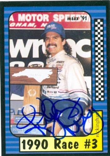
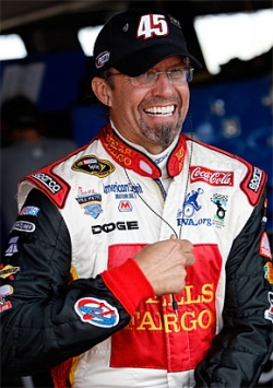
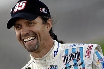
Kyle Petty Voted Worst Dressed Athlete of All Time
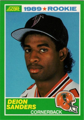
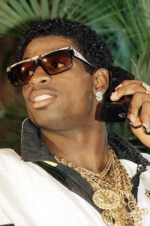
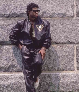
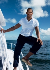
2nd Worst Dressed: Deion Sanders

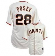
 Home Jersey
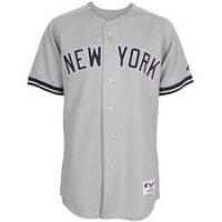 Away Jersey
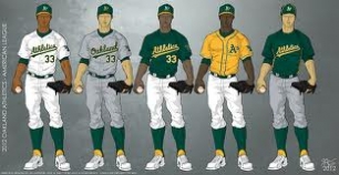

 Away Jersey
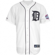 Home Jersey
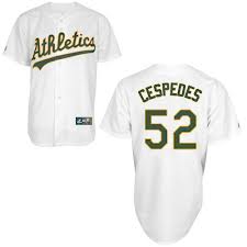
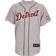 Away Jersey
 The 2012 season will go down as being one of the worst in years for the Boston Red Sox. Fans of the team had a very difficult time getting through the season, especially given the amount of devotion these individuals typically show towards their favorite team. While the team may not have reached expectations throughout the 2012 season, there’s no doubt in anyone’s mind that Red Sox fans will continue to support them, and that 2013 could simply be an entirely different situation. Even if the team wasn’t all that great on the field this year, it’s tough to argue with the fact that they have some of the
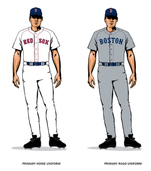
 Home Jersey
 Away Jersey